Case Study

Oklahoma Joe’s BBQ

Delivering a unique dining experience and award winning bar-b-que to a growing number of markets as well as major retailers throughout the US.
BRAND DEVELOPMENT | LOGO CREATION | PACKAGING DESIGN

Adding Bold Flavor to an Established Brand

Basic Ingredients

With over 300 BBQ titles under his belt and a big vision for his BBQ brand, Joe Davidson, Owner of Oklahoma Joe’s BBQ and master BBQ chef, wanted to tighten up the brand he had established. Oklahoma Joe’s is known for great BBQ and the best smokers ever. Joe had visions of BBQ products on the shelves of the mega-retailers and a line of franchises across the country. He knew his original brand wouldn’t carry him there. We were glad to help.

Oklahoma Joe's Barbecue Old Logo
Dinner Plate

Research

The BBQ industry is very diverse, and in the south, BBQ is everywhere. So if you plan to succeed, you should be ready for some stiff competition. As far as brands go, the competition left much to be desired. Joe wanted some history in the brand. Oklahoma Joe’s needed to feel older, but not cowboy. We kept coming back to the 30s and 40s signage and advertising.

Initial Concepts

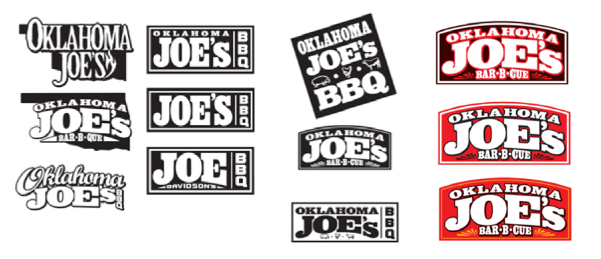
After a few days of thumbnail sketches, some fine tuning and a good amount of advertising history, the direction was taking shape. Joe was set on an all type logo that could act as signage and be a badge for all products to come. A dash of tooled leather, some weathered metal, and a bold type face began to emerge.

Logo Concepts
New Logo

Taking Shape

The leadership at Oklahoma Joe’s kicked around the idea of the shape of the state to be used in the logo to reinforce the brand, but with the goal of franchising the restaurant still firmly in focus, we decided the shape of Oklahoma might limit the appeal across the map. Using the shape might lose the customer’s idea that this is “my” BBQ joint.

Color Choices

Red was always the first choice from Oklahoma Joe’s, but we thought deepening the red helps contrast and raises the perceived value of the brand. We also avoided using a straight black in the color scheme. We chose a dark brown instead to warm the brand and still provide some visual weight. In contrast we employed a chrome yellow to round out the color psychology.

Graphic Standards
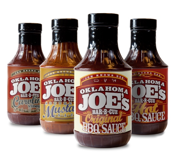
Sauces
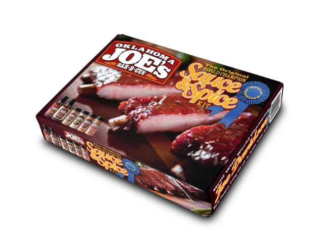
Sauce and Spice Kit

We are very proud of this brand.

“I have been working with Mark since 2008 in the areas of corporate brand identity, package design, graphics, logo wear, presentations, photo shoots, and various areas of printed media. He is always quick to task and works very closely with me to make certain that my projects look like my projects…

Mark is a rare find in todays graphic identity environment and his ability is the reason we have and will continue to use Mark’s skill set!“

– Joe Davidson, World Champion BBQ Cook, JoeDavidson.com 

Coupon
For the Love of Great BBQ Ad
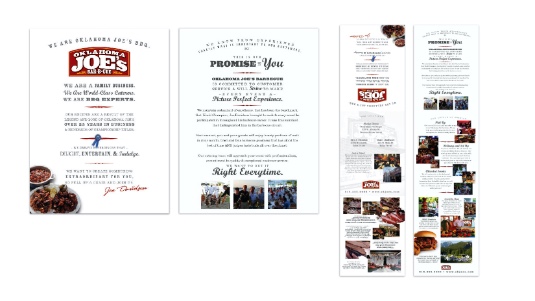
Franchise Book
Ice Cold Drinks Sign
Catering Brochure
Sweet Thang Baker
Joe Knows BBQ
Joe's Prime Rib Smoked
Caterer Ad
Smokers