

CASE STUDY
BerriHealth Brand Refresh
The nation's leading manufacturer of Oregon Black Raspberries needed a new look to stake their claim as the leader in the industry.
FROM THE START
Choosing the right partner.
Steve Dunfield sought a refreshed logo, soliciting proposals from multiple agencies across Oregon and Oklahoma. After initial communications and a clear sense of process and chemistry, he selected our team to lead the project.
RESEARCH
Where we started.
BerriHealth completed an in-depth questionnaire (IDQ) while our team analyzed competitors and the broader berry market. Key findings emerged quickly:
Preserve existing logo equity. Maintain scientific credibility for clinical sales. Modernize without losing the customers who already know the brand.
INITIAL CONCEPTS
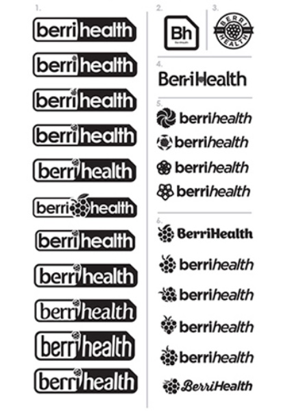
Six concepts. Two contenders.
Thumbnail sketches and rough comps produced six refined concepts. The field narrowed to two options: updating the established "bent rectangle" identity, or salvaging the equity by transferring it into an entirely fresh brand mark.
A NEW DIRECTION
The berry takes the lead.
Concept six's berry element revitalized the brand. The subtle hexagons suggested scientific foundation while offering modern simplicity.
Multiple berry variations explored angles, druplet shapes, stems, and dimensions through collaborative screen-sharing sessions.
COLOR ME HAPPY
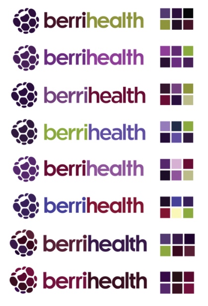
A palette built on the mark.
Color selection followed mark consensus. Multiple rounds refined the palette while addressing typography. A strong black-and-white foundation preceded color application — proof that the identity worked at every level before color did the heavy lifting.
THE FINAL MARK
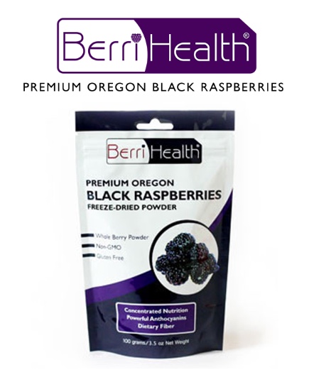
BerriHealth, refreshed.
The completed identity preserves the equity of the original BerriHealth name while introducing a modern berry mark, refreshed type, and a confident palette ready for the next phase of the business.

BEFORE & AFTER
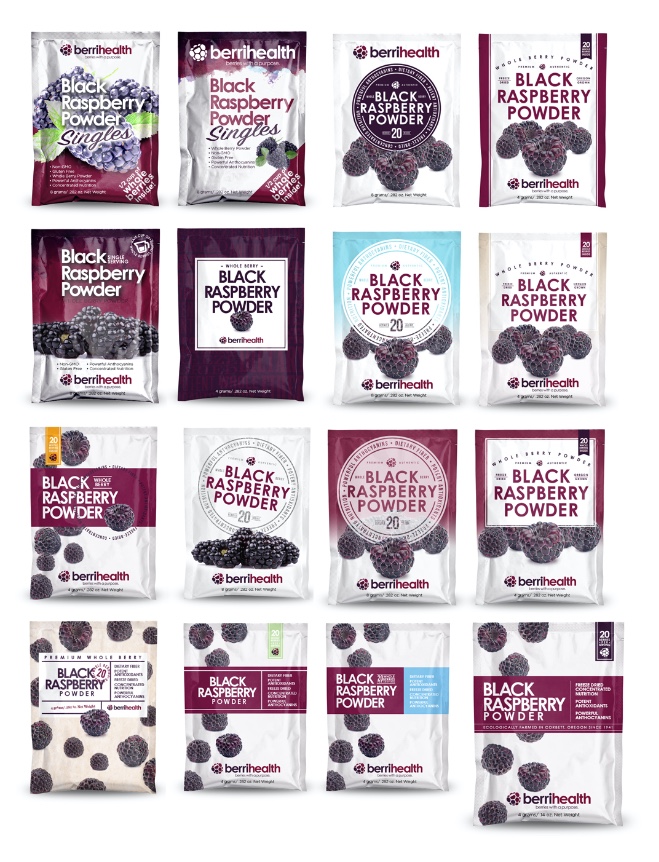
A new shelf presence.
Side-by-side packaging comparisons made the shift unmistakable — preserving recognition for long-time buyers while signaling a clearer, more confident science-forward story for new ones.
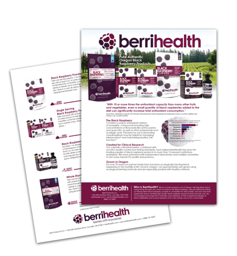
SALES MATERIALS
A story buyers can hold.
The refreshed sales sheet translates the brand into a tool the sales team can hand to clinical and retail buyers — clear hierarchy, credible typography, and the new mark working hard on every page.
IN THE WILD
From sales sheet to shelf.
The new identity rolled out across packaging, sales materials, and the entire product line — giving BerriHealth a unified, scientifically credible presence to lead with in clinical and retail conversations.

After looking at a few different designers for rebranding and redoing our packaging, we decided to choose Mark. His ability to communicate clearly and effectively and have a clear process for getting our design work done was one of the main reasons why.
BerriHealth's refresh preserved decades of brand equity while giving the company a modern, science-forward identity that can stand toe-to-toe with anyone in the functional food space.
A clear process — research, then concept, then color — produced a brand the whole team could stand behind.