

CASE STUDY
byk Branding a Ride Share
With the goal of fostering family adventures and eco-friendly commuting, bicycle ride shares make both possible.
THE OPPORTUNITY
Family adventures, made more accessible.
Our team pursued branding for a bicycle sharing venture in our hometown. We focused on defining the competition (Lime Scooters and others) and creating a brand identity that would stand out from day one.
AUDIENCE
Who we were riding for.
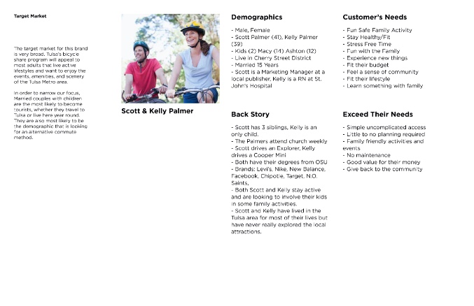
The target market included married couples with and without children. Core messaging emphasized ecological responsibility and active family entertainment, plus economical commuting options that let riders skip traffic entirely.
A bike share that feels like a Saturday morning, not another scooter on the sidewalk.
COMPETITION
Reading the field.
Before sketching a single mark, we mapped the micro-mobility landscape — Lime, Bird, Spin, regional bike shares — to find white space the category had ignored. The audit pointed straight at a family-first, eco-forward position no competitor was claiming.

PROCESS
How the brand came together.
A defined process kept research, strategy, naming, and design in lockstep. Every milestone tied back to the original brief so the brand stayed true to the family-adventure idea from sketch to street.
EXPLORATION
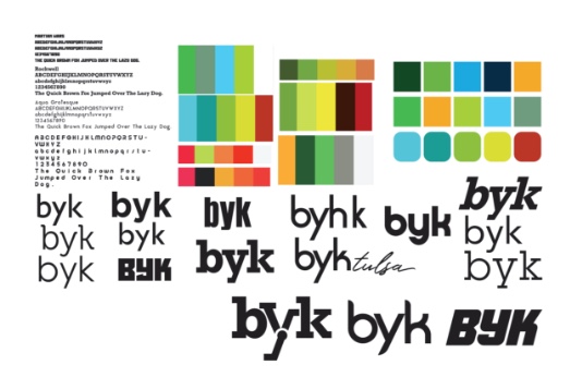
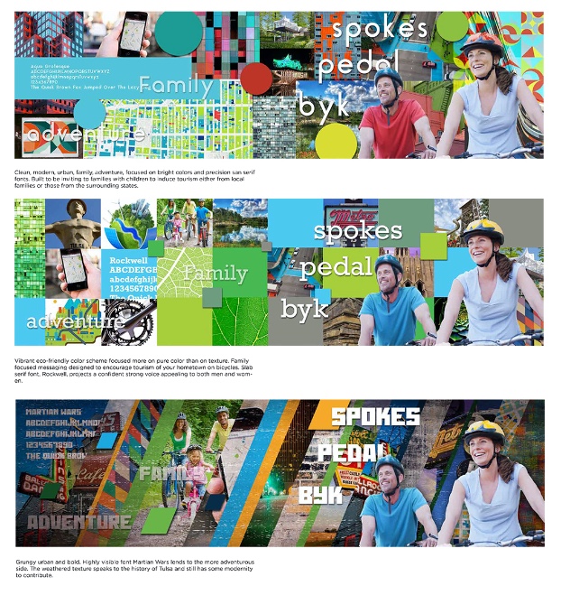
Playing with color and message.
The team explored multiple color schemes and genres, developing mood boards to clarify the desired presentation. Each direction tested a different feeling — adventurous, civic, premium, playful — until the right voice emerged.
CONCEPTS
Logo directions in play.
Three concept rounds pushed the mark in different directions — geometric, hand-drawn, and type-led. Side-by-side comparisons made it obvious which form carried the right energy across vehicles, apps, and signage.
Three names made the short list.
Pedal
An action word that pairs naturally with city names. The near-homophone with "petal" subtly reinforces eco-friendly positioning.
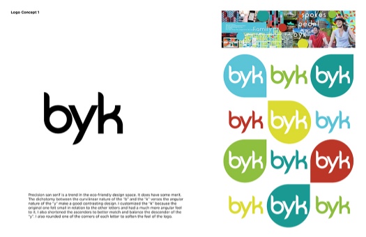
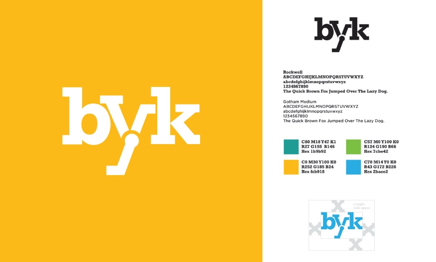
Byk
An alternative spelling of "bike" that offers a unique but familiar edge — easy to say, easy to remember, easy to own.
Spokes
Multiple connotations — wheel spokes, spokesperson — functioning easily as a noun across product and marketing.
THE PICK
byk, with an altered palette.
byk won the day. A refined color palette gave the new mark room to breathe across vehicles, stations, apparel, and apps — everywhere a rider might meet the brand.
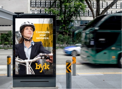
IMPLEMENTATION
On the streets.
From bus wraps to billboards to bike-station wayfinding, byk rolled out as a complete civic system — not just a logo, but a way to navigate a city.
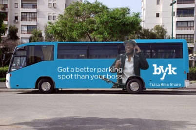
BUS STOPS
Meeting riders where they wait.
Bus-stop placements put byk in front of the audience already opting out of driving — a soft handoff from one mode of shared transit to another.
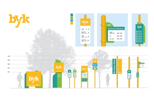
WAYFINDING
Finding the next ride.
Station wayfinding and signage stitched the network together across neighborhoods. Riders never had to guess where to dock — the brand did the navigating for them.
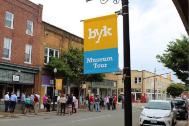
IN THE WILD
Pulaski station, on brand.
On-site signage at Pulaski showed the system at full scale — large-format type, the byk mark, and clear rider cues working together in real-world conditions.
APPAREL
A brand riders can wear.
Branded apparel turned operators and early adopters into walking ambassadors — extending the byk identity beyond the bike and onto the people who run and ride it.

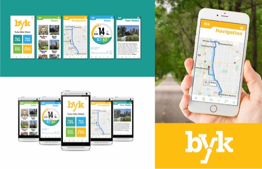
IN HAND
Where the ride begins.
The app extended the brand into every rental, every route, every share. Consistent voice, consistent visuals, one continuous experience from sidewalk to seat.
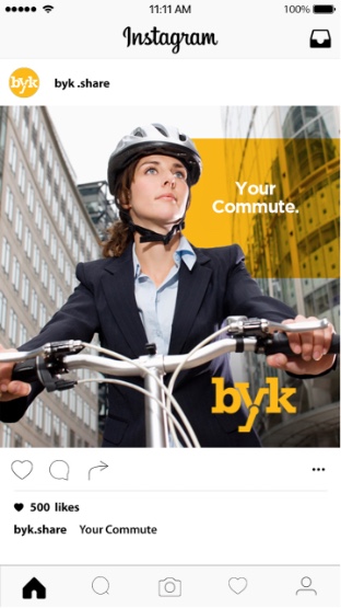
SOCIAL
A feed worth following.
Instagram extended the brand into the rhythm of daily city life — rides, routes, riders, and the everyday adventures that the bike share unlocked.
Overall, we are very happy with the outcome — and it seems to have been a big hit.
A name worth riding for.