

CASE STUDY
IBEKA Naming & Brand Creation
Focused on quality and accessibility for the new adventurer as well as the experienced hiker, a new outdoor gear company steps into the sunlight.
THE CHALLENGE
A company by any other name.
A new outdoor gear company needed more than a logo — it needed an identity that could stand alongside the established names already crowding the trailhead. Quality, accessibility, and a sense of welcome for both the new adventurer and the seasoned hiker all had to live inside a single word.
Before we could design anything, we had to find the name worth designing for.
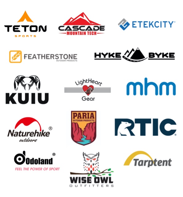
COMPETITIVE LANDSCAPE
Where the market stood.
We mapped the existing outdoor gear category — established players with deep loyalty, rugged visual languages, and decades of momentum. To enter that conversation, our client needed a name with both warmth and grit.
We tested working concepts including Aptus and Montek before landing somewhere unexpected.
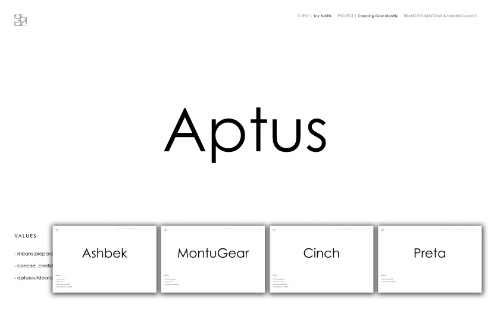
FINALIST: APTUS
Aptus — fit for the trail.
Aptus emerged as one of three finalists — a Latin-rooted name suggesting fit, capability, and readiness. It earned a full identity exploration before the group moved to the next contender.
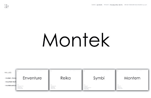
FINALIST: MONTEK
Montek — mountain shorthand.
Montek leaned into the obvious — a compressed reference to the mountain itself. Strong, descriptive, and easy to pronounce, it made the final round before the team chose a less literal path.
A NAME EMERGES
IBEKA.
After working through dozens of directions — including Aptus and Montek — IBEKA emerged as the name that carried the right blend of accessibility, distinction, and adventure.
It was short, ownable, and spoken with the same easy confidence as the people we wanted to wear it.

CONCEPTS
A new identity.
With the name in hand, we explored a wide range of identity concepts — wordmarks, monograms, and emblems — testing each against the brand’s core promise of accessible adventure.
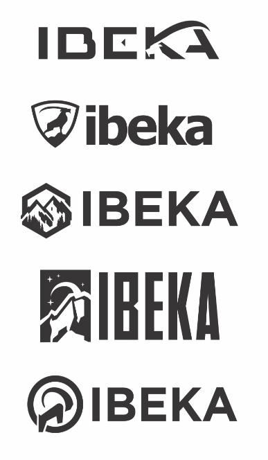
THE MARK
A final identity that earns the mountain.
The chosen mark balances modern type with a peak-inspired silhouette — distinct enough to stand out on a shelf, simple enough to embroider on a patch.
THE COLOR OF MOUNTAINS
A palette drawn from the landscape.
The color system pulls directly from the places IBEKA gear is built to travel — deep forest greens, alpine blues, sunlit ochres, and the cool grey of weathered stone.
Each color earns its place on the mountain.
ICONOGRAPHY
A visual language for the trail.
A custom icon set extends the identity across packaging, hangtags, signage, and digital — built to feel as functional as the gear itself.

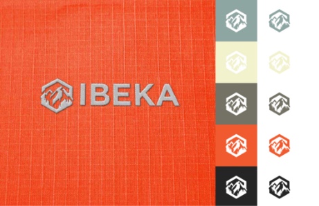
COLOR STUDY
Exploring the palette.
Multiple palette studies tested the mark against deep greens, alpine blues, and earth tones — looking for the combination that read as both outdoor and ownable.
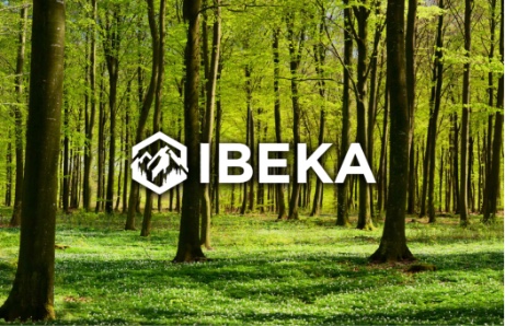
IN CONTEXT
At home in the landscape.
The mark was tested against the environments IBEKA gear is built for — pine forests, alpine ridgelines, and trailhead light — making sure the identity reads cleanly wherever it lands.
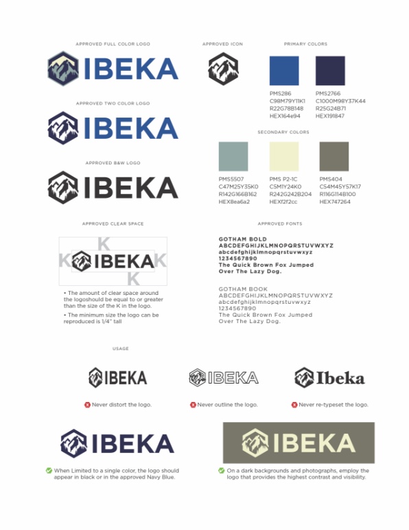
BRAND GUIDE
A system built to scale.
The full IBEKA brand guide codifies the name, logo, palette, type, and voice — giving the team a clear map to grow the brand without losing its bearings.
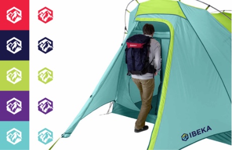
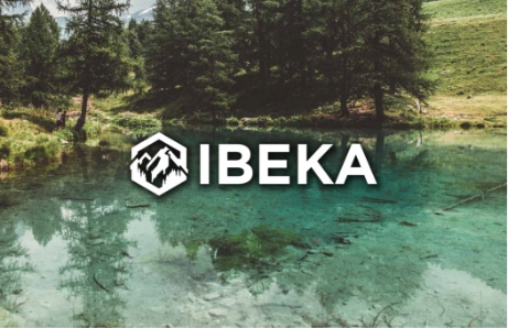
AT THE LAKE
A brand that travels.
From mountain trail to lake shoreline, the IBEKA mark sits comfortably across every environment its customers move through — proof that the identity earns its place beyond a flat artboard.
BRAND ELEMENTS
The pieces that travel together.
Supporting brand elements — secondary marks, patterns, and tag treatments — extend the system across hangtags, packaging, and digital so the identity stays consistent at every touchpoint.

Mark performed outstanding work. His communication style focused on some of the most important aspects being excellent customer service.
From a blank page to a brand that earns the mountain — IBEKA now has the name, identity, and system to step into the outdoor category with confidence.
When the name fits, everything else falls into place.