

CASE STUDY
Netgate Rebrand
Providing leading-edge network security at a fair price — regardless of organizational size or network sophistication.
BLUE SKY
Better brand. Bigger horizons.
With ambitions to expand Netgate's market presence, owners Jaime and Jim Thompson assembled a specialist team for a full rebrand. The objective: double market share and elevate their flagship pfSense product's reach.
RESEARCH
Where we started.
Mile 1 Marketing led a comprehensive market analysis — stakeholder interviews, consumer research, focus groups, and brand recognition testing — to build the foundation for the visual work that followed.
That groundwork shaped every decision from typography to color, ensuring the new identity would resonate with both existing customers and the new audiences Netgate wanted to reach.
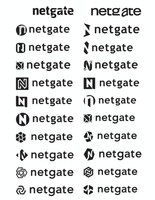
INITIAL CONCEPTS
Dozens of directions.
Development began with a tight set of concept directions and expanded into dozens of iterations and variations. Multiple rounds of refinement followed — collaborative back-and-forth until a clear winner emerged.
TYPE & CROSS
Finding the right voice.
Trebuchet MS was the initial typeface selection. When the client asked us to explore alternatives, we tested Avenir — and after a round of customization, it became the new primary font for the brand.

COLOR CHOICES
Trust, dependability, vitality.
We kept blue as the primary color family — the hues evoke trust and dependability, two qualities Netgate's customers count on. The primary scheme anchors the system and shows up first on logo, packaging, and product UI.
Blue says you can trust us.
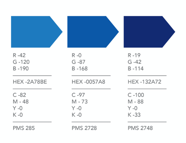
SECONDARY PALETTE
Energy for the edges.
A vibrant secondary palette was added alongside the blue family to bring energy, signal product differentiation, and keep the system from feeling monochromatic across marketing and packaging touchpoints.
The rest of the palette says we're ready to grow.

THE MARK
The new Netgate logo.
Type, mark, and color came together in a final identity built to carry Netgate into its next phase — confident, modern, and unmistakably engineered.

We can't wait to see product come off the line with the new brand. I appreciated Mark's speed and professionalism at every turn.
PRODUCT
TNSR and pfSense, refreshed.
The new identity rolled out across the flagship product lines — TNSR and pfSense — giving Netgate the confident, modern presence it needed to compete for the next phase of growth.
