

CASE STUDY
Oklahoma Joe's BBQ Brand Identity
Delivering a unique dining experience and award-winning bar-b-que to a growing number of markets and major retailers across the US.
BASIC INGREDIENTS
Adding bold flavor to an established brand.
Owner Joe Davidson is a world champion BBQ cook with more than 300 titles to his name. With mega-retailers calling and franchise opportunities lined up coast to coast, his brand needed to be ready to scale without losing the heat that built it.
RESEARCH
Where we started.
The competitive BBQ market demanded a distinctive point of view. We drew inspiration from 1930s and 1940s signage and advertising — heritage that signals craft and history — while steering clear of the dated cowboy clichés that crowd the category.
INITIAL CONCEPTS
Tooled leather and weathered metal.
Thumbnail sketches and advertising research led to an all-type logo built from tooled leather textures, weathered metal effects, and bold typography — designed to hold up on everything from signage to product badging.
TAKING SHAPE
Built for franchise scale.
Leadership considered working the Oklahoma state shape into the mark but ultimately set it aside. Keeping the identity geography-neutral lets franchisees from coast to coast claim the brand as their own.
A great regional brand only scales when every market can call it home.

Color choices.
Deep red
Chosen over bright red for stronger contrast and a richer perception of value.
Dark brown
Used in place of black to add warmth and visual weight to every application.
Chrome yellow
A complementary accent rooted in vintage signage and food psychology.
PACKAGE DESIGN
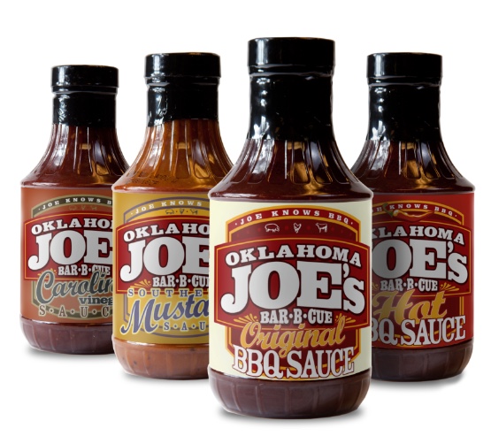
A flavor system on the shelf.
Original-recipe sauces became the flagship retail line — each label engineered to read clearly on shelf and signal the Oklahoma Joe's heritage at a glance.
GIFT & RETAIL
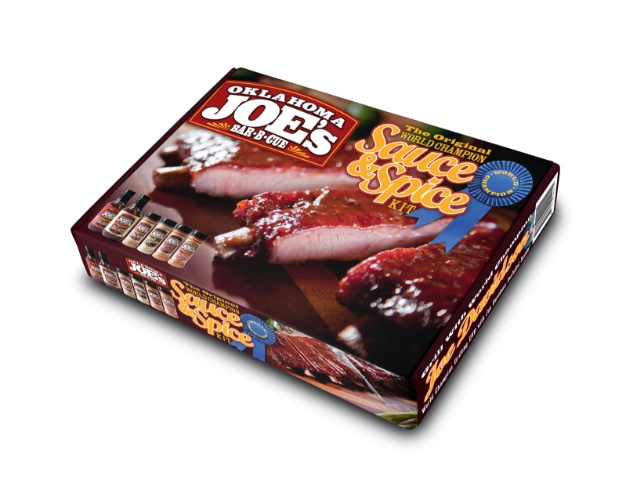
Sauce and spice kits.
A premium pairing of sauces and rubs designed for gifting and retail end-caps — extending the line beyond standalone bottles into giftable kits.
FRANCHISE
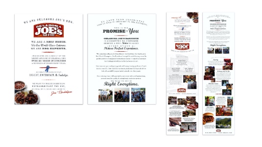
A book for new operators.
The franchise sales kit packages the brand story, operating standards, and proof points into a single book that turns interest into signed agreements.

CATERING
A side business worth feeding.
A dedicated catering brochure and ad system that gives operators a ready-made way to chase corporate orders, weddings, and large-format events.
LOCATIONS
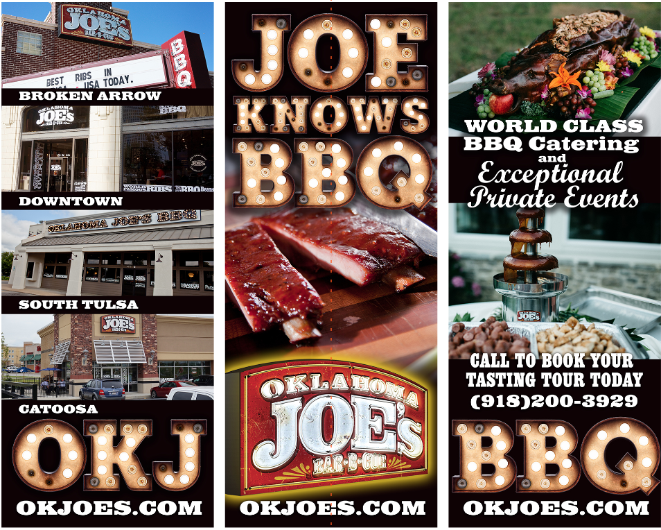
Joe knows BBQ.
A locations brochure carried the brand story and footprint into the hands of partners, franchisees, and operators — a printed proof point that the system had range and roots.
CATERING AD
Print that pulls in big orders.
A dedicated catering ad gave operators a sharp tool for going after corporate events, parties, and bulk orders — pairing menu clarity with the same vintage signage voice.

ON THE MENU
Burgers worth the smoke.
Hero food photography across burgers, prime rib, and sides gave the menu room to do its own selling. Every plate framed for craft, scale, and appetite appeal.

PRIME RIB
Beyond the BBQ.
Prime rib gave the menu a destination dish to anchor weekend visits — proof that Oklahoma Joe's range stretched well past the smokers and into special-occasion territory.

BEVERAGE
Drinks to go with the smoke.
Beverage merchandising rounded out the in-store experience. Branded drink art kept the table-side moments on-brand without competing with the food.

IN-STORE
Telling the smoker story.
Timeline signage built around the smoker turned every restaurant into a storyteller — equipment, technique, and history made visible to guests waiting for their order.

LINE EXTENSION
Sweet Thang.
A Sweet Thang sauce variant extended the line with a sweeter, retail-friendly flavor — same shelf logic, same vintage voice, broader appeal at the grocery aisle.

A 2015 ad that still holds up.
Print ads kept the system humming through key season buys. The vintage texture and chrome-yellow accent translated cleanly from billboards down to a single magazine page.

OUT OF HOME
For the love of great BBQ.
Billboard work that flexes the new identity at scale — bold typography, vintage texture, and the chrome-yellow accent doing the heavy lifting on the roadside.

I have been working with Mark since 2008 in the areas of corporate brand identity, package design, graphics, logo wear, presentations, photo shoots, and various printed media. He is always quick to task and works very closely with me to ensure my projects reflect my vision. Mark is a rare find in today's graphic design environment and remains essential to our continued success.
300+ competition titles. A brand ready for mega-retailer shelves and franchise growth. The work continues — and the flavor stays bold.