

CASE STUDY
Simple Simon's Pizza Rebrand
Serving pizza for over 30 years across nearly 200 franchises in 10 states. Simple Simon's deserved a new look that lived up to the word simple.
30 YEARS
Anatomy of a rebrand.
Coming up on its 30th anniversary and almost 200 stores across 10 states, Simple Simon's Pizza was building a new corporate office in Glenpool, OK. Owners BJ and Becky DuMond saw the move as the perfect moment to rebrand — for corporate and franchise alike.
After plenty of discussion and debate, the project kicked off with three caveats: keep the essence of the original, keep the "pizza S," and keep the original chef's-hat shape if at all possible.
RESEARCH
Knowing the customer, watching the market.
We'd already been working with Simple Simon's for four years, so we knew the perfect customer well. But the pizza category is crowded — we wanted a deeper read on what competitors were doing, what they weren't, and where Simple Simon's could shine.
The ongoing remodel of franchise locations also informed the flavor of the new brand. We started by running Simple Simon's through our Branding Evaluation to surface strengths, weaknesses, and openings.

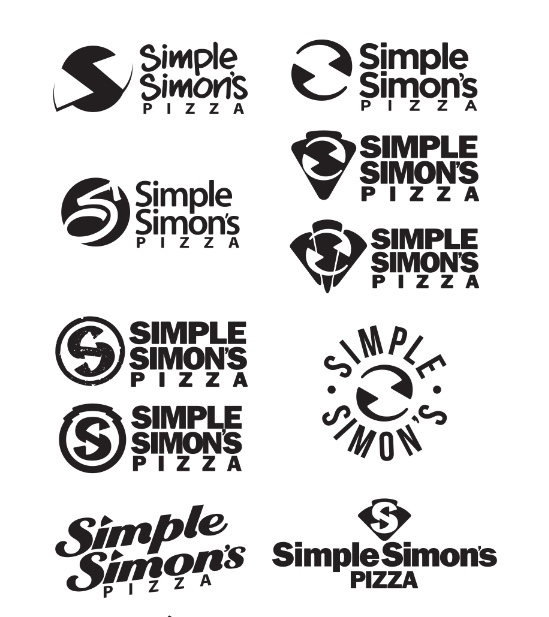
INITIAL CONCEPTS
Narrowing the field.
Extensive thumbnail sketches and rough comps produced a wide variety of concepts. A handful rose to the top. We culled the field to the best six and brought them to Simple Simon's.
Concept exploration ran longer than expected and produced more results than we planned — until the final direction landed on the energy and style the owners wanted to telegraph.
NOT MY TYPE
Splicing fonts to get it right.
Font choice turned into a hurdle. Certain characters in the chosen face didn't sit right with the principals. We hunted for alternates — every time one character got fixed, another would cause trouble.
The only path forward was to splice multiple fonts together or design a new one from scratch. For the sake of budget and deadline, we spliced — and got the look exactly right.
COLOR CHOICES
Two colors. Endless possibility.
The original logo carried too many colors, which had caused production headaches. We stressed simplicity and ease of reproduction, narrowing the palette to black and Simple Simon's classic red.
We are very happy with the results. So is Simple Simon's. So are the franchisees.
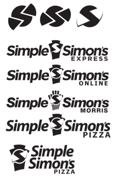
ROUND TWO
A second pass at the mark.
A follow-up concept round pushed the chef's-hat silhouette and the "pizza S" in new directions. Each iteration tested how much the mark could evolve without losing the equity built up over three decades.
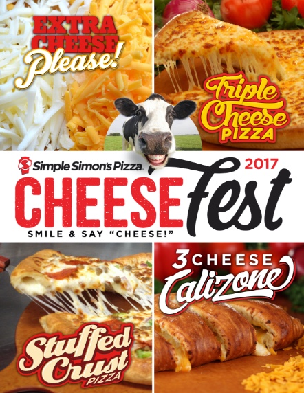
PROMOTION
Cheese Fest hits the wall.
In-store posters like the Cheese Fest promo gave franchisees a ready-made way to drive traffic. The refreshed identity made these everyday materials feel like part of one consistent brand.
WEEKLY DEAL
Tuesday Wing Day.
Recurring deals like Tuesday Wing Day needed art that grabbed attention without crowding the new identity. The promo system gave operators templates that stayed on-brand week after week.

NEW MENU
The Calizone goes big.
Large-format posters for the Calizone gave the new menu item the room it deserved — bold type, the refreshed mark, and a single hero shot doing the selling.
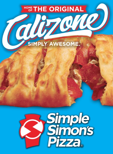
TABLE TALK
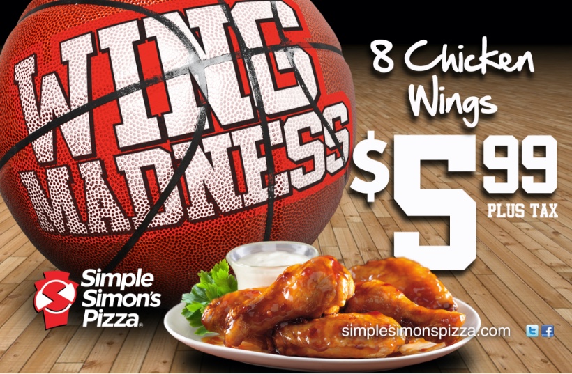
Wing Madness, on the napkin.
Napkin inserts put Wing Madness in customers' hands while they ate. Small surface, but a high-frequency touchpoint — and a chance to land another promo without buying media.
Brand at work.
Promotional posters
Cheese Fest, Tuesday Wing Day, Calizone — every promotion in the new system.
In-store collateral
Napkin inserts and counter materials carrying the refreshed identity to the customer.
Franchise rollout
Consistent applications across nearly 200 locations in 10 states.
Mark has provided graphic services for me for over 20 years. I have always appreciated Mark's rare combination of artistic sensibility and business acumen. He understands that our projects can involve not only a range of creative demands, but also a variety of other critical elements including time, budget, scope, personalities, and the like. I can always count on Mark to deliver fantastic creative in a timely manner no matter what, and within budget. I would not hesitate to recommend him to anyone looking for the same. In short, 'He gets it.'
BY THE NUMBERS
Simple. Scaled.
30+
Years in operation
200
Franchise locations
10
States in operation